

The Real Cost of Cart Abandonment (And How to Actually Reduce It)
Deovate World

The Real Cost of Cart Abandonment (And How to Actually Reduce It)

Sneha Kapoor Sneha Kapoor
Jun 19, 2026 5 min read 2863 views

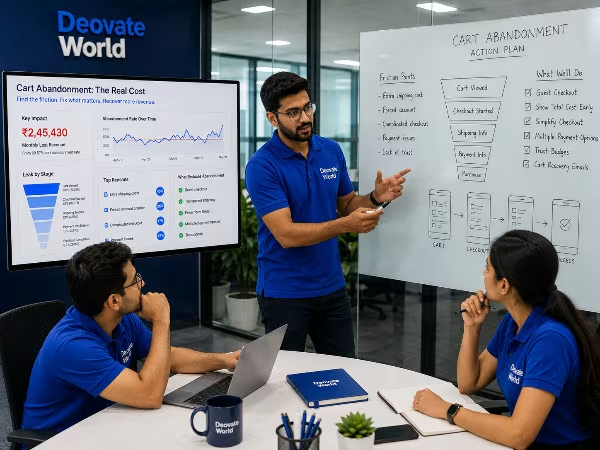
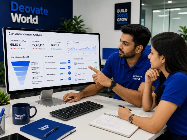
Cart abandonment is one of the most measurable, most consistently ignored revenue leaks in eCommerce. Most stores treat a high abandonment rate as an inevitable cost of doing business online, an unavoidable tax on running a digital storefront, when in reality a large share of it comes from specific, identifiable, fixable friction points inside the checkout experience itself. The businesses that take this seriously and fix the friction methodically see measurable, often surprisingly large, recovery in completed sales, without spending an extra rupee on new traffic.

Where the Abandonment Actually Happens

Cart abandonment is rarely about price alone, even though that is the easiest explanation to reach for. It is far more often about an experience that introduced doubt, confusion, or friction at exactly the moment a customer was psychologically ready to commit to the purchase. An unexpected shipping cost revealed only at the last step. A forced account creation that feels like an unnecessary hurdle. A checkout process that stretches across too many pages. A payment method that simply is not available. Any one of these can be enough to tip a ready buyer back into hesitation, and hesitation at checkout very rarely resolves itself in the customer\'s favor.

Seven Common Checkout Friction Points

  • Unexpected costs revealed only at the final step, shipping, taxes, or handling fees that were not visible earlier in the journey
  • Forced account creation before completing a purchase, adding a barrier for first-time or one-time buyers
  • A checkout process that takes more than three to four steps to complete
  • Limited payment options that do not match what the customer actually prefers to use
  • No visible security or trust signals during the payment step itself
  • Slow page load specifically during checkout, even if the rest of the store performs fine
  • No clear order summary visible before the final confirmation click, leaving customers uncertain about exactly what they are about to pay

Impact of Fixing Each Friction Point

Friction Point Fixed Typical Impact
Guest checkout enabled Meaningful reduction in abandonment at the account-creation step
Shipping cost shown early Fewer surprise-cost exits at the final step
Checkout reduced to 2-3 steps Higher overall completion rate
Multiple payment methods added Captures customers who would otherwise have abandoned
Trust badges near the payment field Increased confidence completing the payment step

The Psychology Behind Checkout Abandonment

Every additional step in a checkout flow is a fresh opportunity for a customer to reconsider. Psychologically, momentum matters enormously in a purchase decision, once someone has decided to buy, the goal of your checkout should be to preserve that momentum and get out of the way, not to introduce new decisions or new information that reopens the question of whether to buy at all. A surprise cost at the final step does not just add a rupee amount, it reframes the entire transaction in the customer\'s mind as \"this store was not upfront with me,\" which is a trust problem, not just a pricing problem.

This is why simply lowering prices rarely fixes a high abandonment rate on its own. If the underlying experience still contains friction and surprise, a lower price just delays the moment of hesitation rather than removing it.

Mobile Checkout Deserves Its Own Attention

A significant and growing share of online shopping now happens on a phone, and mobile checkout experiences are disproportionately where abandonment happens, because small friction that is merely annoying on desktop becomes genuinely difficult on a smaller screen with a virtual keyboard. Long forms, tiny tap targets, payment fields that are not optimized for mobile autofill, all of these compound on mobile in ways that do not show up as clearly in aggregate desktop-weighted analytics. Testing your checkout specifically on a phone, ideally on a mid-range device and an average connection rather than the newest flagship on office wifi, often reveals friction that is invisible from a developer\'s desktop setup.

Recovering Abandoned Carts That Already Happened

Reducing new abandonment is the priority, but a well-built abandoned cart recovery sequence, typically a short series of reminder emails or messages sent over the following days, recovers a meaningful share of carts that were abandoned for reasons other than pure disinterest, a distraction, an interrupted session, uncertainty that resolves itself with a gentle reminder. The most effective recovery sequences are simple: a reminder shortly after abandonment, a follow-up with any relevant reassurance around shipping or returns, and occasionally a modest, time-limited incentive as a final nudge, rather than leading with a discount immediately, which can train customers to abandon carts intentionally expecting a coupon.

The Bigger Picture

None of these fixes require a full store rebuild, and that is precisely why they get overlooked, they are not dramatic enough to trigger a full redesign conversation, so they simply persist quietly for years. The businesses that treat checkout as its own dedicated, continuously optimized project, rather than an afterthought bolted onto the rest of the store, are the ones that consistently convert a higher share of the traffic they are already paying to acquire. Checkout is the single page in your entire funnel where revenue is decided in real time, and it deserves attention proportional to that fact.

Final Thought

Every abandoned cart represents a customer who was close enough to buying to add an item and start the process. That is a far warmer prospect than a new visitor arriving cold, which is exactly why the return on fixing checkout friction is consistently higher than the return on simply acquiring more traffic to send through the same broken funnel.

Gallery

Written by
Sneha Kapoor
Sneha Kapoor
UI/UX Designer
Have a project in mind?

Let's talk about how we can help bring it to life.

Contact Us
Leave a Comment

Share your thoughts on this article

Comments are reviewed before they appear publicly.

0 Comments

Be the first to comment on this article.

More Articles

Brand Identity Mistakes That Are Quietly Costing You Trust

Brand Identity Mistakes That Are Quietly Costing You Trust

Most branding mistakes are not dramatic, they are small inconsistencies that quietly accum...

ERP vs CRM: What Growing Businesses Actually Need First

ERP vs CRM: What Growing Businesses Actually Need First

These two systems get confused constantly, and businesses often invest in the wrong one fi...

Why Skipping QA Testing Costs More Than It Saves

Why Skipping QA Testing Costs More Than It Saves

Skipping or shortcutting QA is one of the most common cost-cutting decisions teams make un...

Our Development Process

From Vision to Digital Success

Every project we take on moves through the same four stages, not because we lack flexibility, but because skipping steps is exactly how good ideas turn into messy builds. Here's what that looks like in practice.

01 Discovery
02 Planning
03 Development
04 Launch
Deovate/process
Trusted by Businesses Worldwide

What Our Clients Say

Discover how our technology solutions have helped businesses innovate, grow, and achieve lasting success through trusted partnerships and measurable results.

Deovate/reviews
Start Your Digital Journey

Let's Build Something Exceptional

You've seen how we think and how we work. Here's where it turns into your project.

You've read about how we think, who leads the work, and what a project with us
actually looks like day to day. The next step is simple: tell us what you're building, and we'll tell
you honestly whether we're the right fit - and if we are, exactly what that plan looks like.

Start Your Project
FAQs

Frequently Asked Questions

Still have a question after reading about our team and process? Here are the ones people ask most.

Deovate

FAQs

Quick answers to common questions

What's actually the biggest, most common reason people abandon a cart right before buying?

Unexpected costs revealed at the very last step - shipping fees, taxes, or extra charges that weren't visible earlier in the process - is one of the most consistent culprits, since it feels like a bait-and-switch even when it's unintentional. A close second is a checkout process that's simply too long or demands an account be created before completing a purchase. Both of these are fixable friction points, not fundamental flaws in the product or the offer itself.

Is cart abandonment mostly a pricing problem, or is it really about the checkout experience?

It's much more often the checkout experience than the actual price, which is part of why so many businesses misdiagnose it and discount their way toward a problem discounting doesn't fix. A visitor who's already added something to their cart has effectively decided they want it - the abandonment usually happens because something in the next few steps introduced friction, doubt, or a surprise, not because the price itself suddenly became unacceptable.

Does requiring an account before checkout really make that much of a difference?

Yes, more than most businesses expect - forcing account creation adds a real barrier at exactly the moment a customer is ready to complete a purchase, and a meaningful share of people will simply abandon rather than deal with creating yet another password. Offering guest checkout as the default option, with account creation as an optional afterthought post-purchase, tends to measurably reduce this particular drop-off point.

How much does site speed during checkout actually affect abandonment specifically?

Quite a lot, since checkout is exactly the moment a customer's patience is thinnest - they're already committed to buying and a slow, laggy payment step introduces doubt right when trust matters most. A checkout flow that feels sluggish or uncertain, even for a few extra seconds per step, gives customers time to second-guess the purchase or simply get frustrated and leave, which is a very different psychological moment than browsing a slow product page.

Do cart abandonment emails actually work, or is that an outdated tactic?

They still work, reasonably well, particularly when sent soon after abandonment and framed as a helpful reminder rather than an aggressive sales push. What's changed is that generic, delayed abandonment emails perform worse than they used to, since customers have grown used to them. A well-timed, specific reminder - especially one addressing a likely reason for the abandonment, like a shipping cost concern - tends to outperform a generic 'you left something in your cart' template.

Should I offer a discount to people who abandon their cart to try to win them back?

It can work, but it's worth being careful here, since customers can learn to abandon carts deliberately to trigger a discount if you use this tactic too consistently. A better first move is usually addressing the actual friction that caused the abandonment in the first place - fixing surprise shipping costs, simplifying the form - before defaulting to a discount as the solution to every abandoned cart, regardless of the actual cause.

How do I even find out where in my specific checkout flow people are dropping off?

Analytics tools that track step-by-step funnel completion will show you exactly which stage - cart, shipping info, payment - has the biggest drop-off, which tells you where to focus rather than guessing. Watching a handful of real session recordings of people going through checkout often reveals the specific moment of hesitation even more clearly than aggregate funnel data alone, especially for subtler friction points like a confusing form field.

Is mobile checkout abandonment different from desktop, and does it need separate fixes?

Often yes, since mobile checkout has its own specific friction points - small tap targets, awkward keyboard input for card numbers, slower connections - that don't necessarily show up the same way on desktop. If your abandonment rate is notably higher on mobile specifically, that's usually a sign the mobile checkout experience itself needs dedicated attention rather than assuming whatever works for desktop automatically works for mobile too.

What's a realistic reduction in abandonment I should expect after fixing the obvious friction points?

It varies a lot by starting point and industry, so we won't quote a single number that doesn't reflect your specific store, but businesses that fix clear, high-friction issues - surprise costs, forced account creation, a slow checkout - typically see a meaningful, measurable improvement rather than a negligible one. The size of the improvement usually correlates with how significant the friction was to begin with.

Where should I actually start if I want to reduce cart abandonment on my store?

Start by mapping your own checkout flow as if you were a first-time customer with no loyalty to your brand, and note every point of friction, however small it seems. Cross-reference that with your actual funnel analytics to see where the real drop-off is happening. Fixing the biggest, clearest friction point first - rather than trying to overhaul the entire checkout at once - tends to produce faster, more measurable results.

Deovate

Get In Touch

We'd love to hear about your project

Please enter your name.
Please enter a valid email.
Please enter a valid phone number.
Please enter a subject.
Please enter a message.

Thanks! Your message has been noted.

Book a Meeting