
Brand Identity Mistakes That Are Quietly Costing You Trust
Deovate World

Brand Identity Mistakes That Are Quietly Costing You Trust

Anjali Deshmukh Anjali Deshmukh
Jul 16, 2026 5 min read 2305 views

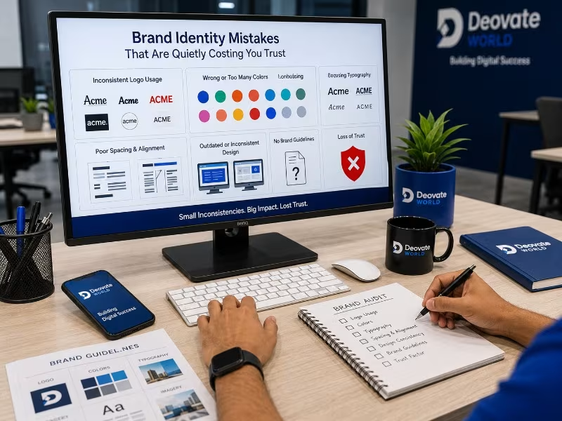
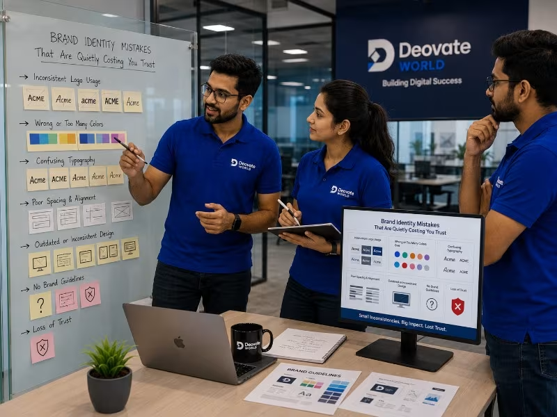
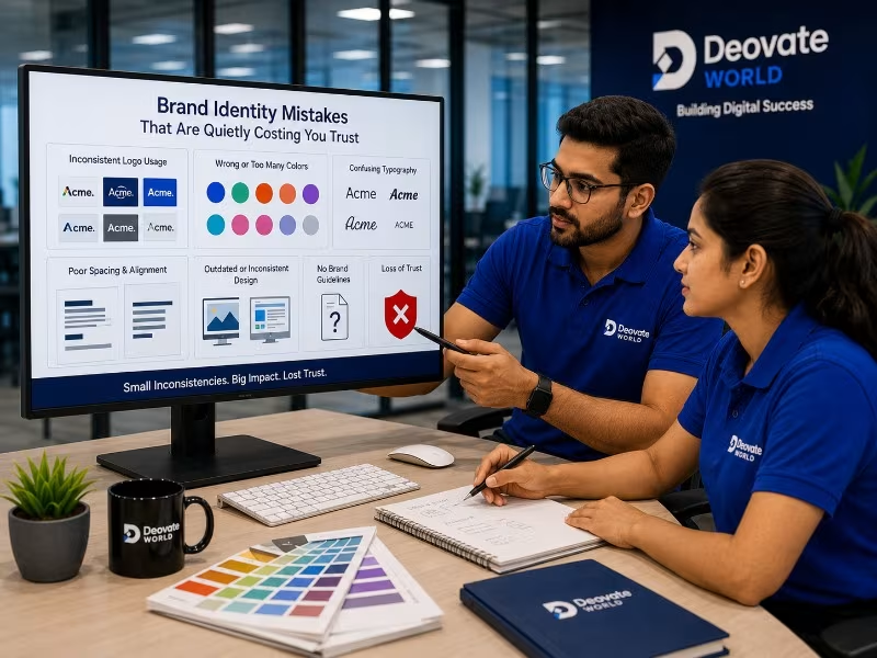
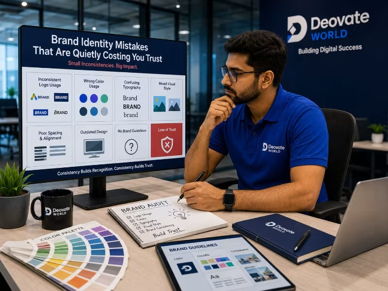
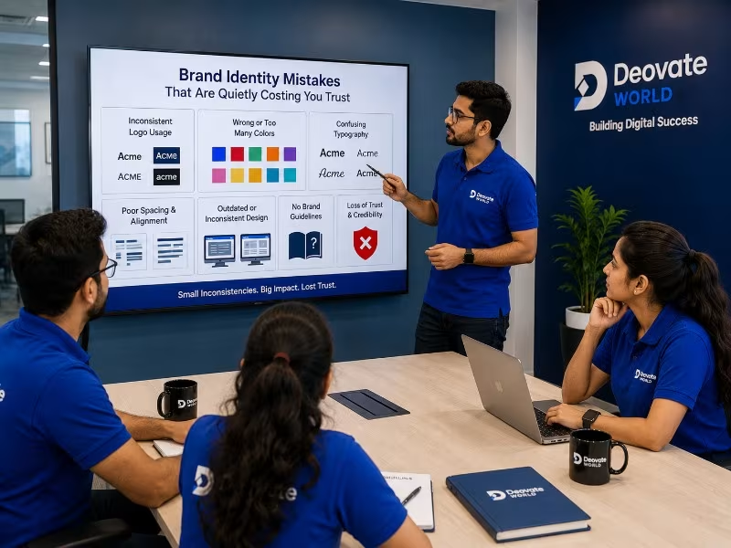
Most branding mistakes are not dramatic, they are small inconsistencies that quietly accumulate until a business looks less credible than it actually is, without anyone inside the company noticing the slow drift. A slightly different logo file used on Instagram than on the website. A brand color that shifts a few shades between the printed brochure and the digital ad. A tone of voice that sounds formal in an email and casual on social media, as if two different companies were writing them. None of these individually feel like a crisis, which is exactly why they persist for years, unaddressed.

Why Small Inconsistencies Matter More Than You Think

A buyer evaluating your business rarely consciously thinks about your logo alignment, your specific shade of blue, or your font choice. But they register these details subconsciously, as a signal of how much attention the business pays to detail overall. Inconsistent branding does not just look mildly unpolished, it quietly reduces trust before a single word of your actual pitch, product, or service quality is even considered. In competitive markets, where a buyer is comparing you against several alternatives, that subconscious trust deficit can be the deciding factor even when your actual offering is genuinely stronger.

Five Mistakes We See Constantly

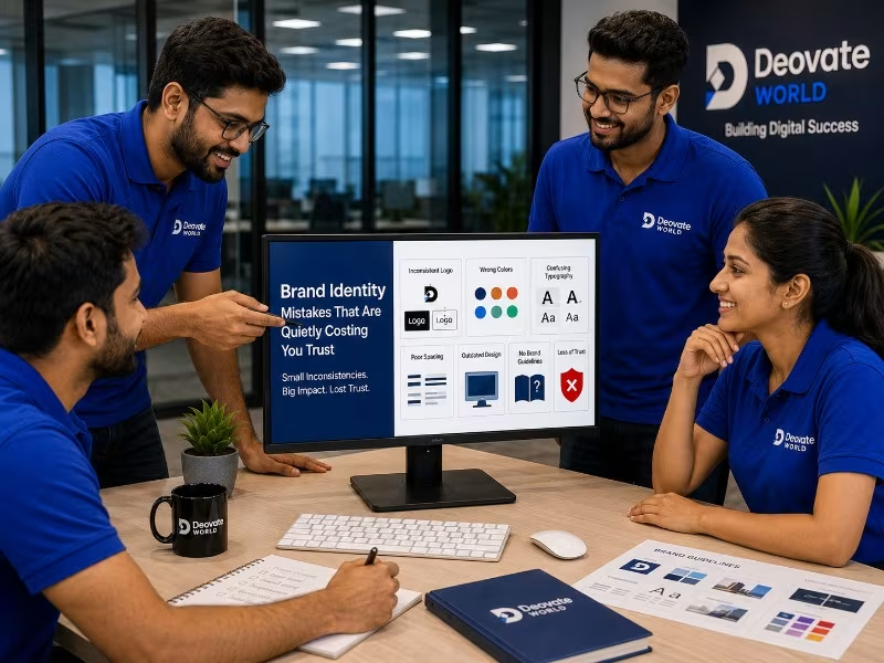
  1. Using multiple slightly different logo versions across different platforms instead of one consistent, locked master file that every team member pulls from.
  2. Choosing colors that shift slightly between the website, social media, and printed materials, because nobody defined exact hex and print color codes in the first place.
  3. No defined typography system, resulting in a different font appearing on every new document, presentation, or social post depending on whoever created it.
  4. Marketing materials that look like they were made by different people at different times, because they usually were, without a shared brand reference to work from.
  5. A visual identity that was designed once, early in the business\'s life, and never revisited or refined as the business matured and its positioning evolved.

Quick Brand Consistency Checklist

Touchpoint What to Check
Website Correct logo file, brand colors matching hex codes exactly
Social Media Profiles Same logo crop and color treatment across all platforms
Business Cards & Stationery Matches the primary brand guideline document exactly
Email Signature Uses the approved logo and font, not a default system font
Marketing Materials Follows the same visual system as the website

The Cost of Inconsistency Is Rarely Measured, But It Is Real

Because inconsistent branding does not trigger an obvious complaint or a support ticket, businesses rarely attribute lost deals or hesitant customers to it directly. Instead, it gets absorbed into vague explanations like \"the market is tough right now\" or \"we need better salespeople,\" when part of the actual friction was a first impression that quietly undercut credibility before the conversation even started. This is difficult to measure precisely, but it is not difficult to observe once you start paying attention: businesses with tightly consistent branding are consistently perceived as more established and trustworthy than their actual size or age would suggest, and the reverse is equally true.

Why Growing Businesses Are Especially Vulnerable to This

Early-stage businesses often build their first brand assets quickly, sometimes as an afterthought while focused on the actual product or service. As the business grows, more people touch the brand, a new hire designs a slide deck, a freelancer builds a social campaign, an intern makes a flyer, each pulling from slightly different reference points because no single locked source of truth exists. The inconsistency compounds with every new person who touches brand materials without a clear guideline to follow, which is why the problem tends to get worse, not better, as a business scales, unless it is deliberately addressed.

What a Proper Brand Guideline Actually Prevents

A well-built brand guideline is not a vanity document, it is a practical tool that prevents exactly this kind of drift. It defines the locked logo files and their acceptable variations, the exact color codes for both digital and print use, the approved typography pairing, and enough tone-of-voice direction that anyone writing on behalf of the business sounds recognizably consistent with everyone else who has written for it. Once this exists, onboarding a new designer, freelancer, or marketing hire becomes dramatically faster and safer, because they have a clear reference instead of having to guess or reverse-engineer the brand from old files.

The Fix Is Usually Simpler Than Expected

Fixing inconsistent branding rarely means starting over from a blank page, and that misconception is often what stops businesses from addressing it at all. It usually means auditing what already exists across every platform and printed material, identifying which version of each asset is actually correct, defining one locked set of files and rules, and making sure every future piece of material pulls from that single source instead of being recreated from memory or guesswork each time. This is a contained, achievable project, not a full rebrand, and the return on doing it properly shows up in how the business is perceived long before it shows up in any measurable metric.

Final Thought

Brand consistency is one of the few areas of business where the fix is genuinely cheaper than the ongoing cost of ignoring the problem. A locked, well-documented identity pays for itself the first time it saves a new hire from guessing, and the first time a prospective client perceives your business as more established simply because everything they saw looked like it came from the same place.
Gallery

Written by
Anjali Deshmukh
Anjali Deshmukh
HealthTech Writer
Have a project in mind?

Let's talk about how we can help bring it to life.

Contact Us
Leave a Comment

Share your thoughts on this article

Comments are reviewed before they appear publicly.

0 Comments

Be the first to comment on this article.

More Articles

ERP vs CRM: What Growing Businesses Actually Need First

ERP vs CRM: What Growing Businesses Actually Need First

These two systems get confused constantly, and businesses often invest in the wrong one fi...

Why Skipping QA Testing Costs More Than It Saves

Why Skipping QA Testing Costs More Than It Saves

Skipping or shortcutting QA is one of the most common cost-cutting decisions teams make un...

Local SEO for Service Businesses: The Complete Practical Guide

Local SEO for Service Businesses: The Complete Practical Guide

For businesses that serve a specific area, showing up in local search results often matter...

Our Development Process

From Vision to Digital Success

Every project we take on moves through the same four stages, not because we lack flexibility, but because skipping steps is exactly how good ideas turn into messy builds. Here's what that looks like in practice.

01 Discovery
02 Planning
03 Development
04 Launch
Deovate/process
Trusted by Businesses Worldwide

What Our Clients Say

Discover how our technology solutions have helped businesses innovate, grow, and achieve lasting success through trusted partnerships and measurable results.

Deovate/reviews
Start Your Digital Journey

Let's Build Something Exceptional

You've seen how we think and how we work. Here's where it turns into your project.

You've read about how we think, who leads the work, and what a project with us
actually looks like day to day. The next step is simple: tell us what you're building, and we'll tell
you honestly whether we're the right fit - and if we are, exactly what that plan looks like.

Start Your Project
FAQs

Frequently Asked Questions

Still have a question after reading about our team and process? Here are the ones people ask most.

Deovate

FAQs

Quick answers to common questions

What's the most common small branding mistake that businesses genuinely don't notice themselves?

Inconsistent logo usage - different versions, colors, or spacing across the website, social media, and printed materials - is one of the most common ones, and it's easy to miss because each individual instance looks fine on its own. It's only when a customer sees the brand across multiple touchpoints that the inconsistency registers, even if only subconsciously, as something slightly off or unpolished, which quietly chips away at perceived credibility.

Does font inconsistency across our website and marketing materials really matter that much?

It matters more than most business owners expect, because typography is one of the fastest, most subconscious signals of professionalism a viewer processes. When your website uses one font family and your social graphics or printed materials use a completely different, mismatched one, it reads as disorganized even if the individual pieces are each well designed, since the human eye picks up on inconsistency between related things faster than it consciously registers why something feels off.

How do I even audit my own brand for these kinds of small inconsistencies?

Pull together every customer-facing touchpoint - website, social profiles, email signatures, business cards, invoices - side by side and compare them directly, rather than reviewing each one in isolation from memory. Inconsistencies that are invisible when you're looking at one piece at a time tend to jump out immediately once you're comparing them next to each other, which is exactly why a dedicated audit catches what day-to-day use doesn't.

Is it better to fix these inconsistencies gradually, or all at once?

Depends on scale, but generally a coordinated fix - updating your core brand guidelines first, then rolling changes out across touchpoints in a planned sequence - produces a more consistent result than fixing things piecemeal as you happen to notice them. A gradual, unplanned approach risks introducing new inconsistencies even while fixing old ones, since there's no single reference guide everyone's working from during the transition.

Can inconsistent branding actually lose us real customers, or is this more of an aesthetic concern?

It's a real trust issue, not purely aesthetic. Customers, often without consciously realizing why, associate visual consistency and polish with reliability and legitimacy, especially for newer or lesser-known businesses that haven't yet built trust through reputation alone. A visually inconsistent brand doesn't necessarily scare customers away outright, but it does quietly lower the trust bar they're evaluating you against compared to a competitor who looks more buttoned-up.

What's the fix if we don't have the budget for a full rebrand right now?

You usually don't need a full rebrand to fix consistency issues - a documented brand guide covering your existing colors, fonts, and logo usage rules, applied consistently going forward, solves most of the problem without touching the actual identity itself. The mistake is often not a weak identity to begin with, just an undocumented one that's drifted slightly with every new piece of material created by a different person or tool.

Do small businesses really need formal brand guidelines, or is that overkill for our size?

Even a simple, one-page guide - core colors with exact codes, approved fonts, logo spacing rules - prevents most of the drift that causes inconsistency over time, and it doesn't need to be an elaborate corporate document to be effective. The overkill risk is more about creating something so complex nobody actually references it, not about having guidelines at all. A lightweight, actually-used guide beats an elaborate one that sits unopened.

How does inconsistent branding affect how we're perceived compared to bigger competitors?

It widens the perceived gap unnecessarily. A polished, consistent brand identity is one of the more affordable ways a smaller business can compete on perceived professionalism against a larger, better-funded competitor, since visual consistency doesn't require a huge budget, just discipline and a clear reference guide. Letting that consistency slip is effectively giving away one of the few advantages that's genuinely within reach regardless of company size.

Should social media graphics follow the exact same rules as our main website branding?

Largely yes, with some reasonable flexibility for the format - social content often needs slightly different proportions or a more casual tone, but core brand elements like colors, logo usage, and typography should stay recognizably consistent across both. If someone sees your social post and then visits your website, it should feel unmistakably like the same business, not two different brands that happen to sell similar things.

What's the realistic first step to fixing brand inconsistency without overhauling everything?

Start with a straightforward audit comparing your core touchpoints side by side, identify the two or three most glaring inconsistencies, and fix those first rather than trying to perfect everything simultaneously. From there, documenting simple, clear guidelines prevents the same drift from creeping back in as new materials get created down the line. Assign one person ownership of the brand guide too, even informally, since inconsistency often creeps back in simply because no one felt responsible for catching it before something new went live.

Deovate

Get In Touch

We'd love to hear about your project

Please enter your name.
Please enter a valid email.
Please enter a valid phone number.
Please enter a subject.
Please enter a message.

Thanks! Your message has been noted.

Book a Meeting