- +91-99141-56467
- info@deovateworld.in

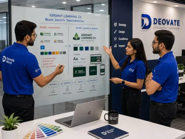
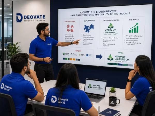
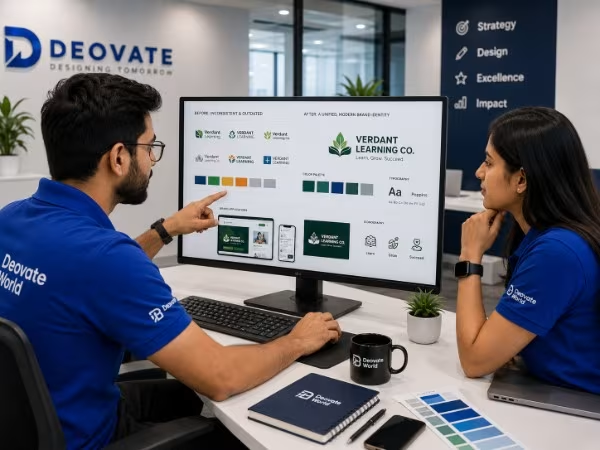
<p>Verdant Learning Co. had built a genuinely strong online learning product, but its visual identity had been assembled piecemeal over several years, inconsistent logo files, mismatched colors across platforms, and marketing materials that looked like they came from different companies.</p>
<p>The inconsistent branding was quietly undermining trust with prospective institutional clients evaluating Verdant against more established, visually polished competitors, despite Verdant's product being genuinely comparable or better.</p>
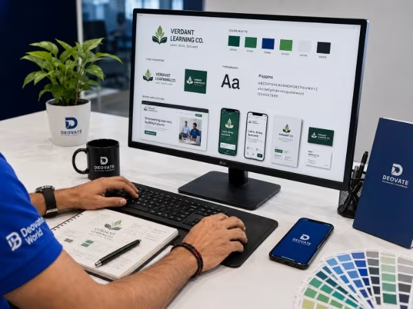
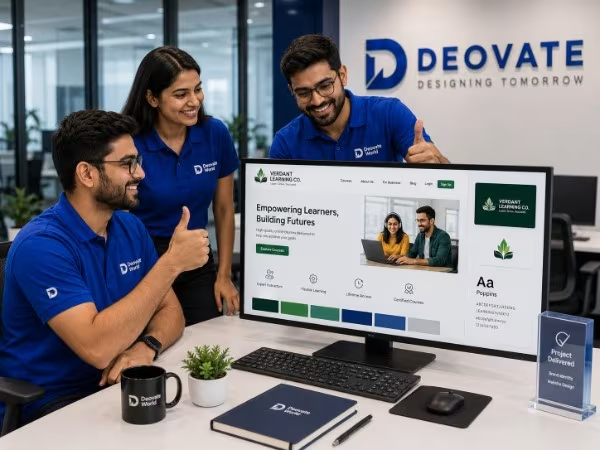
We audited every existing brand touchpoint, then built a complete, locked identity system, refined logo, defined color and typography rules, and a clear usage guideline document, and rolled it out consistently across the website, marketing materials, and sales collateral.
Verdant reported a noticeably more confident reception in institutional sales conversations following the rebrand, with several prospective clients specifically commenting on the more professional, cohesive presentation compared to previous pitches.
"Our product was always strong, but our branding was quietly working against us in every enterprise pitch. The difference in how prospects react to our materials now is genuinely noticeable." — Co-Founder, Verdant Learning Co.
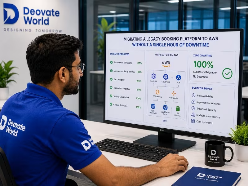
Skyline Travel Group's booking platform was running on aging, on-premise infrastructur...
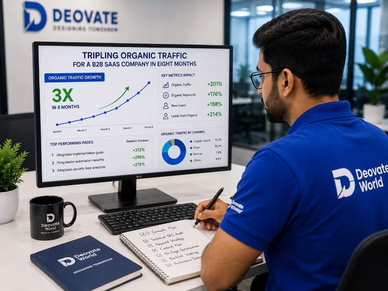
Northbridge Software Solutions had a technically solid product but almost no organic searc...
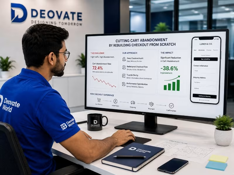
Lumen & Co. was running a visually strong fashion store with healthy traffic, but a ca...